


‘Data on its own has zero value,’ said Bill Schmarzo on the Data Chief podcast. The numbers, stories, and insights behind the data give it meaning. But how can you explore data to unlock its true potential? You need the right tools and strategies to visualize, analyze, and interpret data in a way that reveals actionable insights.
AI-powered visualization tools help you transform complex data into visually appealing formats that are easy to interpret. Using charts, graphs, and interactive dashboards, you can identify hidden patterns, trends, and outliers more quickly.
This article lists the top AI tools for data visualization and how they revolutionize how you interpret information.
How Does AI Tool Help in Data Visualization?
AI tools help enhance data visualization in many ways:
- Automatic Chart Recommendations: The tool’s AI algorithm can analyze data and recommend the best charts or visualizations. This helps you better represent your data visually through charts, scatter plots, or heatmaps without needing deep technical knowledge.
- AI-Driven Insights: One of the key features of AI-powered data visualization tools is their ability to provide insights that allow you to interact with data more intuitively. For example, if you want pointers from a chart or a report, you can ask the tools specific questions like ‘What factors contribute to an increase in sales?’. AI will interpret your query, analyze the data, and directly highlight relevant trends and insights in the visualization.
- Identifying Key Influencing Factors: Some data tools incorporate AI features that help identify the key influencing factors within the datasets. These features enable users to recognize hidden patterns and detect anomalies.
Top AI Tools for Data Visualization
Below is the list of best AI tools for data visualization:
Qlik
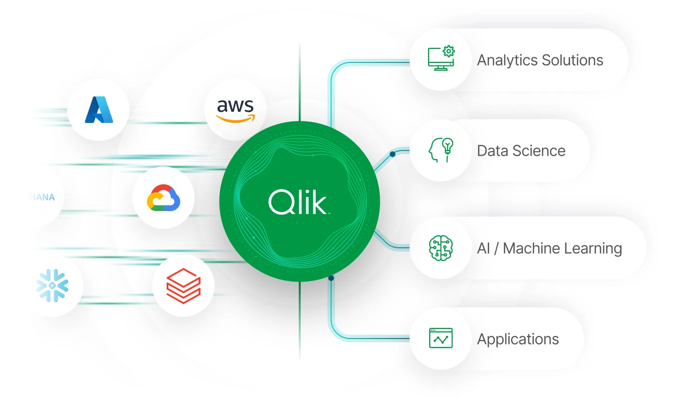
Qlik is a modern data analytics and visualization platform. Its unique associative engine allows for intuitive data discovery and helps uncover insight that traditional query-based tools might miss. With AI and ML built into its foundation, Qlik provides automated recommendations to help you quickly explore vast amounts of data.
Features of Qlik
- The Associative Analytical Engine in Qlik brings all the data together and maps relationships within your data, creating a compressed binary index. This helps to explore data more interactively.
- AI splits feature is present within the decomposition tree, where you can use algorithms to identify and highlight key contributors to metrics.
- Qlik Answers is an AI assistant that provides personalized answers to your questions.
- The Insider Advisor Search feature helps you create visualizations and analyze data by asking questions in natural language. You can ask the question in the search box or select fields from the asset panel. This feature interprets the question and provides visualizations from the data model.
ThoughtSpot

ThoughtSpot is a cloud-based BI and data analytics application that helps you analyze, explore, and visualize data. Its AI-driven search and automated insights simplify data discovery and improve business decision-making.
Key Features of ThoughtSpot
- ThoughtSpot offers an AI agent called Spotter, which answers your questions and provides business-ready insights. It allows you to interact with the tool in natural language, where you can ask questions and get AI-generated insights. You can also ask follow-up questions or jump-start a conversation from an existing analysis with Spotter and get relevant visualized responses.
- The SpotIQ is an AI-powered analysis feature that allows you to surface hidden insights within your data in seconds, providing a full view of what’s happening in your business. Each insight is described in a plain language narrative, making it easy for you to understand the findings.
- The Live Dashboards feature of ThoughtSpot enables you to create personalized and interactive dashboards from your cloud data. You can customize these dashboards to display the most relevant insights and interact with data by drilling down and filtering, exploring trends in real time.
Looker

Looker is an AI-powered BI solution offered by Google that is used for analytics and data visualization. It provides a flexible UI that allows you to create customized dashboards and reports, making data accessible and actionable for decision-making across teams.
Key Features of Looker
- LookML is a modeling layer that enables advanced data transformation by translating raw data into a language both downstream users and LLMs can understand. It helps you establish a central hub for data context, definitions, and relationships, enhancing all your BI and AI workflows.
- Looker offers real-time dashboards built on governed data that enable you to perform repetitive analysis. You can explore functions like expanding filters, drill down to understand data behind metrics, and ask questions.
- Looker Studio is another looker’s self-service capability. It allows you to create interactive dashboards and ad hoc reports, provides access to 800 data sources and connectors, and has a flexible drag-and-drop canvas.
- Gemini is an AI assistant that helps to accelerate the analytical workflow. It assists you in creating and configuring visualizations, formulas, data modeling, and reports.
Microsoft Power BI

Microsoft Power BI is a cloud-based self-service analytical tool for visualizing and analyzing data. It allows you to connect your data sources quickly, whether Excel spreadsheets, cloud-based documents, or on-premises data warehouses.
Key AI Features of Power BI
- The AI Insight feature in Power BI allows you to explore and find anomalies and trends in your data within the reports. The insights are computed every time you open or interact with a report, such as by changing pages or cross-filtering your data.
- You can use bright narrative summaries in your reports to address the key takeaways. This feature provides automated and human-readable insights directly within your reports. The summaries are generated based on the data, offering clear and easily understandable descriptions of trends, patterns, and key metrics. You can even customize these summaries’ language and format for specific audiences, adding further personalization to your reports.
- Power BI integrates with Azure Cognitive Services, bringing advanced AI features such as text analytics, image recognition, and language understanding. These services help you improve data preparation by enabling better handling of unstructured data and enhancing the quality of your reports and dashboards.
Tableau
Tableau is an AI data visualization and analytics tool that you can use to analyze large datasets and create reports. With Tableau, you can organize and catalog data from multiple sources, including databases, spreadsheets, and cloud platforms. Its drag-and-drop functionality and real-time preview features make it intuitive and easy to use.
Tableau’s key feature:
- Tableau Prep is a feature that uses AI to automate data cleaning and preparation tasks, allowing you to focus more on analysis. The AI algorithms help you detect data patterns and quickly transform raw data into usable format, making the preparation process more efficient.
- Using the bins feature in Tableau, you can group data into discrete intervals, making it easy to understand and visualize data distribution more effectively. Using this feature, you can categorize numeric data into bins or buckets to better understand patterns such as frequency or trends across different ranges.
- Data Stories is a tool for adding the Explain Data feature, which will enable you to create automated, plain-language explanations for your dashboards. The Explain Data feature allows you to inspect and locate key data points, diving deeper into visualization. It also provides AI-driven answers and explanations for the value of data points.
Sisense

Sisense is a BI and data analytics platform that assists your organization in gathering, analyzing, and visualizing data from various sources. It has a user-friendly interface where you can explore data and make reports. Sisense simplifies complex data and helps you transform it into analytical apps that you can share or embed anywhere.
Key Features of Sisense
- With AI Trends in Sisense, you can add trend lines using statistical algorithms and compare trends with previous or parallel periods to identify patterns or anomalies.
- Sisense offers data integration through Elastic Hub. This hub allows you to integrate data from multiple sources into ElasticCube or Live Models, which are abstract entities that organize your data.
- Sisense Forecast is an advanced ML-powered function that you can apply through a simple menu option to any visualization based on time data, including area, line, or column. It allows you to see predictive movements in the future.
- The Simply Ask feature in Sisense uses natural language processing to allow you to interact with data by asking questions in plain language. You can directly type your question in the Sisense interface, and the NLP engine within Sisense processes the query, providing automated suggestions and appropriate visualizations.
Conclusion
AI tools for data visualization help you interact with data more intuitively. The tools allow you to transform raw data into clear and actionable insights. These tools streamline decision-making and boost productivity by providing advanced features like predictive analytics, real-time insight, and natural language queries.