The ability to visualize large amounts of data effectively is a remarkable asset for any company. When information and data are graphically represented, this is called data visualization. Data visualization tools simplify the identification of patterns, anomalies, and trends in large amounts of data through graphical representations such as charts, graphs, and maps.
IBM estimates that 2.5 quintillion bytes of data are generated daily via social media, sensors, websites, and the like. This information is used by a wide variety of management systems to regulate operational procedures.
Because of its promising future, data analytics has become an attractive field for many people. So, joining Data Analytics Bootcamps can help you find a dream career.
You may learn the ins and outs of data visualization by reading this blog.
Data Visualization – Let’s Define
Data display includes unit attributes and variables. Visualization-based data discovery tools let companies develop personalized analytical conclusions from heterogeneous data sources. You can use advanced analytics to create dynamic and animated graphics for desktops, laptops, tablets, and smartphones.
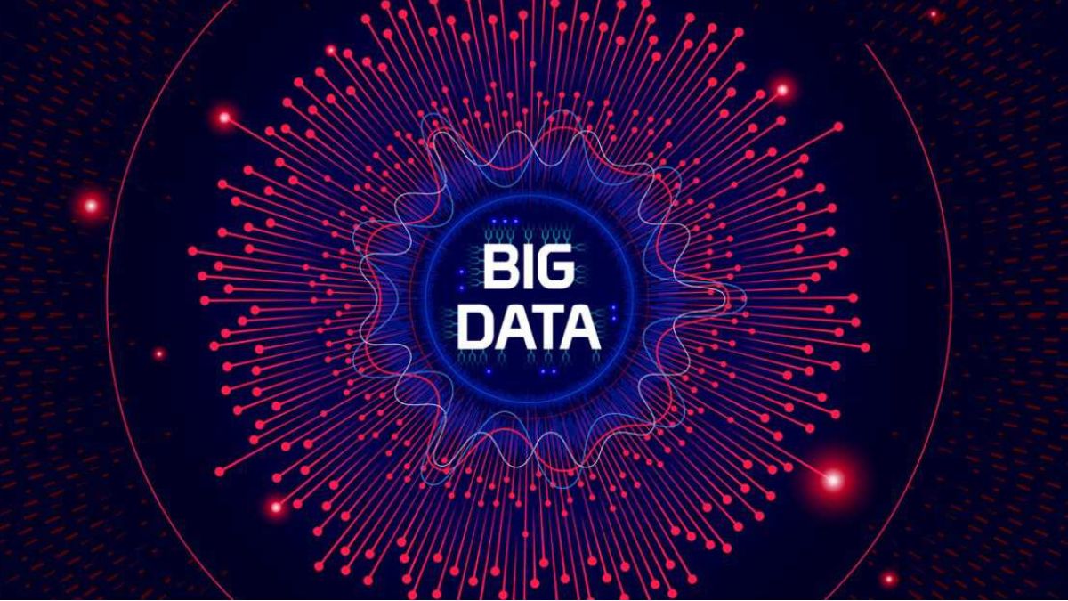
Big Data Visualization
Big data are high-volume, high-speed information sets that require new handling to optimize processes, gain understanding, and make decisions. Big data difficulties include acquisition, storage, evaluation, sharing, searches, and visualization. Visualization is an “information front end.” Data visualization isn’t mythical.
- Visualizing good information is crucial; a quick look can reveal errors or exciting patterns.
- Visualization always shows the correct decision or intervention; it’s not a substitute for critical thought.
- Visualization offers assurance: data are exhibited, not showing what’s necessary. Manipulating visualization’s effects is possible.
Visualization creates tables, graphs, photos, and other intuitive display ways. Visualizing big data is more complex than small data. The expansion of established approaches to visualization was far enough along. Scientists utilize feature extraction and geometric modeling in large-scale data visualization to reduce information volume before accurate processing. When visualizing massive data, it’s crucial to use the proper representation.
Analytical techniques used in Big Data visualization
- Word cloud/network diagram
Big data difficulties necessitate novel visualization techniques for semi-structured and unstructured data—a word cloud visual shows the frequency of a word in text by its size. On unstructured data, this method displays high- or low-frequency terms.
The network diagram is another semi-structured or unstructured data visualization method. Nodes (network actors) and ties depict relationships in network diagrams (relationships between individuals). They are used to analyze social networks or map product sales across geographic areas.
- Box plots
It is common practice to summarize data distributions using five numbers: minimum, first quartile (Q1), median, third quartile (Q3), and maximum. It is known as a boxplot. What values your outliers have can be determined using this method. Also, it can detect and characterize asymmetry, clustering, and skewness in your data.
A box plot is a helpful graph for visualizing the distribution of data points. Box plots are often used to compare distributions over several groups or datasets. While they may look simplistic compared to a histogram or density plot, they have the advantage of taking up less space. It may be the case that you require additional details beyond the measures of central tendency when working with certain distributions/datasets (median, mean, and mode). Knowing how much the data varies is crucial.
- Symbol maps
In reality, symbol maps are nothing more than maps superimposed over a fixed range of longitude and latitude. Tableau’s “Marks” card, which displays clients’ location information, allows you to produce a compelling picture quickly. You can adjust the map’s label to reflect various levels of detail based on this data, which can be seen graphically in either a pie chart or a form.
- Line charts
A row graph is a type of data visualization in which the data is shown as a series of rows. In line diagrams, the rows run horizontally across the page, and the y-axis represents the number of points earned.
- Pie charts
Pie charts are a simple visual representation of portion sizes. The amount is depicted as a circle cut into portions (wedges). Each coin is worth one hundred percent of the total value. Typical applications illustrate differences in spending, demographic subgroups, or study answers across many categories.
- Bar charts
A bar graph can be used as a visual tool to compare and contrast data from many locations with a single glance. A graph or chart consisting of parallel bars is known as a bar graph or bar diagram. You can make bar charts either horizontally or vertically. It’s important to realize that the longer the bar, the more significant benefit it provides. The bar graphs have two axes to display information.
Closing lines
Data is king in today’s digital age, but it costs more than ever. Visualization of data has the potential to become an indispensable part of any presentation and the quickest way to grasp the information being presented. Visualizing data, besides, is a fun and exciting process. Given the variety of methods at your disposal, it is simple to make matters worse by choosing the wrong approach. Suppose you want to communicate your message to your audience using data visualization effectively. In that case, you’ll need to have a firm grasp on the data itself, the nature of that message, the data you’re working with, and how your audience processes visual content. The time and effort spent trying to plot the data using sophisticated Big Data techniques may be unnecessary if a straight-line plot will accomplish the trick. It will reveal its hidden treasures if you take the time to learn about your data.
In conclusion, Big Data represents a fantastic prospect for continued development. Every company and group is now doing it. To further advance, we must also devote time and energy to mastering the concepts of big data and the visualization tools used to examine and analyze data sets. Effective individuals in this area are in high demand, and every company and organization is looking for them.